In ChurnIQ Studio you can easily adjust the appearance and functionality of your charts, making the data more visually appealing and relevant to the audience. Upon successful rendering of the chart, it can be further customized.
To enable this, select the menu on the “Visualization” tab. To find even a broader selection of chart types, press the three dots tab. Here you can choose from multiple ways of arranging and displaying your data visually.
After choosing the preferred display, the next step is to configure the visualization settings. To do this click on the “Edit” tab on the right upper corner of the “Visualization” bar. Here you can modify the parameters like: axes, positions, series, etc.
Dimensions and measures
In ChurnIQ Studio, Measures and Dimensions are fundamental components used to analyze and visualize data.
- Measures are quantitative values that represent the numerical data. They can be aggregated - used to perform calculations or statistical analysis. In ChurnIQ Studio they will be represented as numbers that stand for e.g. Subscriber Count, Revenue or Transaction Count.
- Dimensions are non-numerical qualitative attributes used to describe categories of data. These are generic names that reflect data segmentation and provide context to the measures, e.g. Country, Month, etc.
In the dashboard you can easily customize measures and dimensions you want to include in your reports. You can narrow down the data you want to display in your reports by eliminating or adding custom fields in the “Results” section.
Series Menu
This section refers to a set of options that you can use to customize behavior and appearance of your data series. In this menu you can:
- Select data series that you want to customize.
- Change the color of data series
- Show or hide the data labels
- Adjust the look of data - e.g. present them in a form of a line or a column.
Adding axes
Customizing axes for your visualization may be crucial if you want to present data series that represent different metrics.
In ChurnIQ Studio data can be displayed using Y1, Y2 or X axes. Initially, Y1 is set as a default vertical axis, however if there is a need to add another measure, then Y2 axis can be applied. That way you can present multiple measures with different scales in one chart. X axis is the horizontal axis where the dimensions are displayed.
To add Y2 axes to your chart, you need to choose the Left/Right Axes list and drag and drop one of your data series to the chosen list.
Right after you will see the data series ascribed to separate lists in the left side menu.
Example:
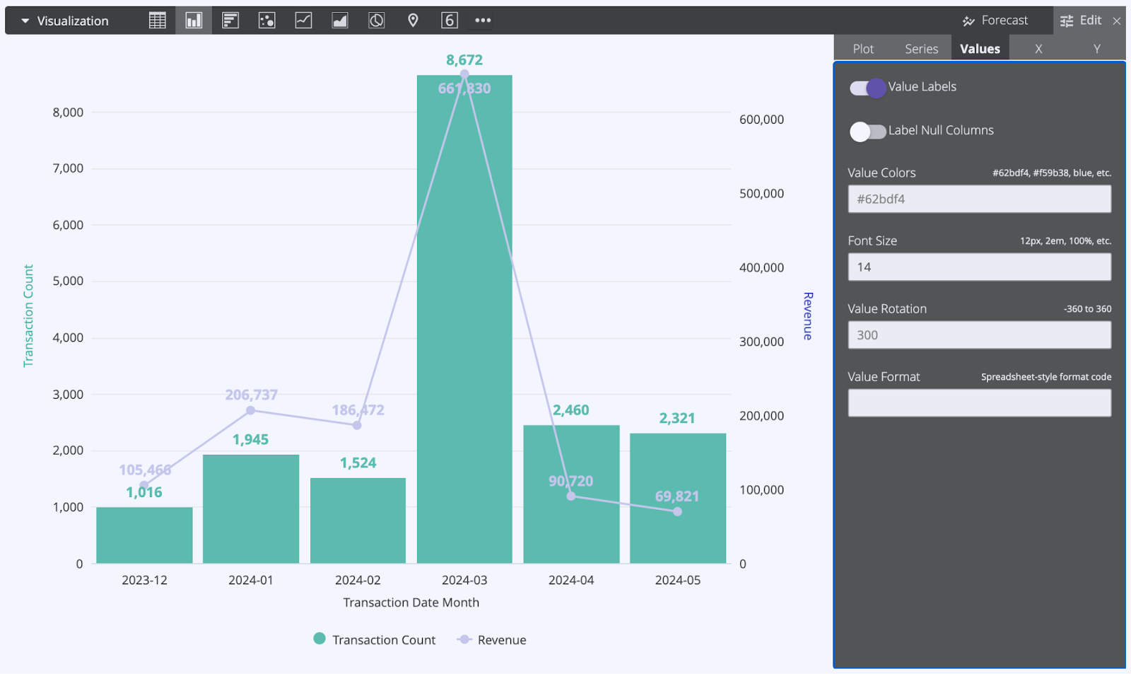
You have created a bar chart showing your monthly revenue. By using the “Series” menu you can change the color of each bar to make it clearly distinguishable from other data series. As the bars show the transaction count from each month, you can create a revenue value in the form of a trend line to make it more pronounced. What is more, you can also assign the data sets to different axes as they refer to different scales.
Label formatting
In ChurnIQ Studio you can adjust the labels of values and perform custom value formatting. It simply means that in this menu you can customize the font, add titles, data points display and more.
To enter this menu go to Edit → Values → Enable Value Labels
Below you can see the chart with added value labels - they are represented in numbers added at the top data points of a line graph. Use the switch to decide if you want your value labels to be visible.